Posts

Uprising 2: Lead and Destroy Review | Tank again

Image
I would define Uprising 2 as a game belonging to the "iterative sequels" category, a typology of games who are direct sequels with some new gimmick while sharing most of their mechanics. Depending on your standing on the predecessor, this can be either a good or bad thing. Aesthetics The 3d graphics used here are a step up from its predecessor: the textures are cleaner and made much more readable. Apart from this detail, the overall look is pretty much the same. User interface being heterogeneous, the particle details being flashy, and a sparse amount of animations are all traits in common with its predecessor. Like one could expect, they are just a bit more refined. The voice acting is sparely used, but what there is it's fine enough. For some reason, the music is bugged, the game wouldn't play the tracks despite them being present in the dedicated folder, it's not deal breaking, but it's worth to mention. The tracks themselves aren't something extraordi...

MONOBOT Review | Glowing, but not shining

Image
Indie titles are a beloved category of games today and it's easy to see why: from some who try to fill the void of a particular game that hasn't been released in years, to others who tackle experimental mechanics that on paper seem to be absurd and in practice become captivating. However, despite being all around well-made, not all titles manage to break the mold and, due to unexciting reasons, MONOBOT doesn't either. Aesthetics Desolation, solitude and a calm sky... The game uses a 2d digital drawn style, it looks fine, the drawing are defined enough. The animations are simple, the main character does little poses and facial expressions to show emotions. Cute to watch, but ultimately nothing that sticks out in a good or bad way. There isn't any kind of voice acting or sound to imitate speech, the few characters interactions are executed completely silently. I don't rememb...

Armed and Dangerous Review | Bullets, pubs and Tea

Image
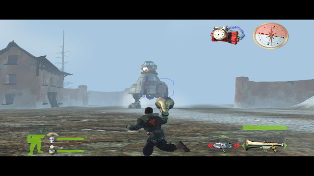
What is the first thing that does pop in your mind when I say the name "LucasArts"? Usually, it's either one of their point-and-click masterpieces or one of the many Star Wars based games that they licensed. But beyond these, LucasArts also published titles out of their comfort zone, titles such as Armed and Dangerous. Aesthetics Despite the extravagant action, the visuals are rough Even by the standards of 2003, this game looks bad, the models are excruciatingly edged, the textures are flat, the lighting is uninteresting, and the animations are awful, especially during the cutscenes the characters move like malfunctioning robots. The artistic directors must have gone on vacation during development and left the job for the rest of the unlucky crew. It's a shame really, because there are really things that would look wonderful if everything was polished, like the explosions of the zeppelins and the remaining debris, or the wanted posters which update ...

Crying Suns Review | Searching hope in a perishing universe

Image
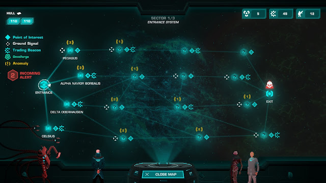
A phenomenon that has been consistent through gaming history is the one where a team of developers gets inspired by a title they played and started having ideas on how to expand it with new mechanics or a more captivating story. Crying Suns is the product of such phenomenon, with its inspiration being the hit Faster Than Light. Aesthetics The morbid sight of a collapsing ship The title uses a mixture of 2d pixel art, used for characters and UI, and 3d voxels for the ships and various space objects. The two styles mix well together, they feel consistent and belonging to the same game. Animations aren't an aspect that got much attention, since most of the action is reserved for the space-ships, there aren't many opportunities to make expressive gestures either, so the characters on the bridge got the bare minimum to not look like still figures. Because of this, there has been extra care to the particle details, especially when looking an exploding ship after a fight, the effects...

Knights of the Temple Review | Deus kinda Vult!

Image
In the past, I expressed my enjoyment for Enclave , for, despite its many defects, it had a really enjoyable set of mechanics and a charm typical of newbie developers with little experience but a lot of passion. So, when I found out that Knights of Temple was made by the same company, I was curious to see what it would have come out from them. Aesthetics The camera manages to give some nice shots despite its rigidity The 3d graphics are what one can imagine for a game that aims for a realistic style. The characters look tolerable (although a bit expression-less during close-ups), the scenery is nice to see, both in the Gothic looking churches and the Arabian cities, but ultimately it remains a product of its time, with textures and models straight out of 2004. My only complaint are about the demons, I wished they appeared sooner in the game, their design together with the hellis...

Plebby Quest Review | Crusader Princes

Image
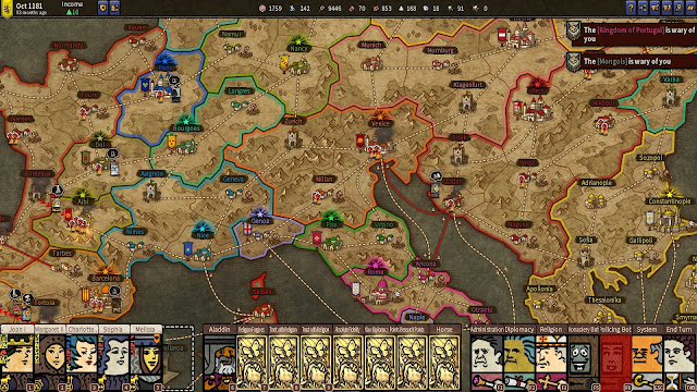
Grand strategy games are notorious for being highly complex titles with a steep learning curve. If someone wanted to recommend a simpler take on the genre to a much less experienced player, the choice seems very slim. However, it can happen that a studio may come in with a product to fill that desire, and Plebby Quest: The Crusades is one such product. Aesthetics Even a bloody battle is made cute by the art style The 2d graphics have been drawn with a cutesy, highly stylized art style. The colors are lively but not exaggerated, and it's overall good-looking. A feature I appreciated is the clarity in which the game tells you how much liked you must be with a kingdom to make a trade/alliance agreement, cutting out the slack of trying to get a deal through trial and error. The characters in the form of rectangles warp in a compelling way, with gestures representing their mood, like when they are angry and vibrate aggressively. The little yellow soldiers are expressive too when they s...

Impossible Creatures Review | Who's a good abomination of nature?

Image
I am fascinated by the 6th generations of video games, it was an era of experimentation and risk, many developers were creating projects with bizarre ideas or unseen concepts. One of such games was Impossible Creatures, with the premise of "what if you could create your own units based on mixtures of two animals?". Aesthetics These looks were the top pinnacle of fine at the time The graphics are what they are, child of 2003, with the usage of saturated textures and blocky models. I don't think that they have aged as gracefully as other games from this era though, the models are too rough to be appealing, even for the standards of that age. Unless you have nostalgia for this kind of looks, like I do, you are not going to enjoy the view. Animation is another area the game lacks behind, when the creatures run, the limbs move in a robotic artificial way, and when ...